Meet the team at Spectrum Marketing Group of New Bedford. Not only did they design the website you are visiting now, they helped us create the brand of the Moby Dick Brewing Co.
They designed the logo that greets you whenever you stop by our home page (and which is part of the exterior signs outside our home at the corner of Union and South Water streets in New Bedford). The logo features a white whale’s tale slicing into a deep blue ocean, a garland of golden wheat and, beneath, a scarlet pennant embossed with our motto, “We’re Brewing History.”
Slide down the home page until you come to the labels of each of the hand-crafted lagers and ales we will start serving when we open in March. Click on each label and it will take you into a page devoted to each brew: its characteristics, ingredients, taste, and the food pairings that go best.
But before you get caught up in all those words, look closely at the individual labels. Each is unique, a distinguished work of art linking a visual scene to the name of the beer, each name derived from a phrase or name in Herman Melville’s great novel, “Moby-Dick.”
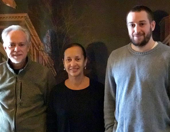
The design team included one of Spectrum’s principals, Jeff Wotton, at right in photo, who has “always had a passion for history” and loves the artwork of the 19th and early 20th centuries.
He wanted a design that would make use of “the classic novel, the history of whaling in this area and pair it up with a new product.”
That was exactly what we at Moby Dick Brewing wanted, and it’s exactly what Jeff and his team did.
Two of Spectrum’s artists, Ron Fortier, left, and Paula Batchelor (who incidentally are engaged to be married in June 2017), got it immediately.
Fortier worked on the Moby Dick Brewing logo until it was just right. It was, he says, like working on a logo for a product associated with other great American icons like “Gone With the Wind” or “The Wizard of Oz.”
In other words, it had to be done right.
“It’s a brand new logo, obviously, but it looks like it’s been around. A vintage look,” he says.
Meanwhile, Batchelor worked on the individual beer logos and created a memorable series of drawings — pieces of art that we believe will become as familiar and as widely appreciated as the very beers and ales associated with them.
“We wanted something that had a little of a retro feel but some contemporary tones,” she says.
Her favorite? The portrait that is the label for “Ishm-Ale,” named in honor of the narrator of Melville’s novel and the story’s only survivor.
For Wotton, the project was personal and important, a chance “to create an iconic brand for generations to come.”
And that’s just what they’ve done.